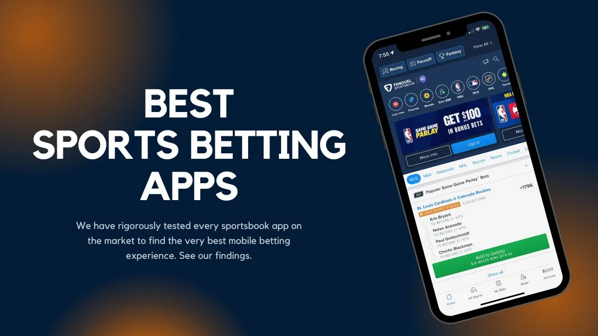
Mobile Betting App User Experience Optimization: The Unseen Game You Need to Win

Let’s be honest. Your mobile betting app is competing with everything. Social media feeds. Streaming services. Text messages. It’s not just competing with other bookmakers anymore. The battle for user attention is brutal, and the user experience (UX) is your secret weapon—or your biggest liability.
A slick, intuitive app feels like a well-trained caddy, handing you the right club before you even ask. A clunky one? Well, that’s like trying to place a bet while wearing oven mitts. Frustrating, slow, and a surefire way to make users abandon their cart—or in this case, their bet slip.
First Impressions Are Everything: The Onboarding Sprint
You never get a second chance at a first impression. This isn’t just a cliché; it’s a fundamental law of the app universe. The first 60 seconds after download determine whether a user becomes a loyal customer or just another statistic in your uninstall rate.
Think of your onboarding process as a sprint, not a marathon. Users want to get to the action. Here’s how to streamline it:
- Guest Access: Allow users to browse odds, explore features, and even build a bet slip before forcing them to register. Let them get a taste of the action.
- Social Sign-On: Offer Google, Apple, or Facebook login. Typing out an email and a complex password on a small screen is a conversion killer. Honestly, it’s 2024. This is non-negotiable.
- Progress Indicators: A simple “Step 1 of 3” bar reduces anxiety and sets clear expectations. It tells the user, “This won’t take long, we’re in this together.”
The Core Loop: Speed, Simplicity, and That Perfect Bet Slip
Once a user is in, the core betting journey needs to be frictionless. This is where you win or lose. It’s the heart of the entire operation.
Navigation That Feels Like Second Nature
If users have to think about how to find the live football section, you’ve already failed. The navigation should be instinctive. A bottom navigation bar with clear, universally understood icons (Home, Live, Search, Account) is the industry standard for a reason. It’s thumb-friendly and predictable.
The Almighty Bet Slip
This is your checkout page. It must be perfect. Any hesitation here, and the moment is lost. Key optimizations include:
- Sticky Bet Slips: The slip should slide up from the bottom and be accessible from anywhere in the app with a single tap.
- Instant Odds Updates: Nothing feels more unfair than seeing one price and getting another. The technology exists for real-time updates—use it.
- One-Click Betting for Logged-In Users: If a user is logged in and has funds, placing a bet should be a single confirmation tap. Not three. One.
| Feature | Poor UX | Optimized UX |
| Login | Mandatory before browsing | Social sign-on & guest access |
| Navigation | Buried hamburger menu | Thumb-friendly bottom bar |
| Bet Placement | Multiple screens & confirmations | One-click betting |
| Live Streaming | Buffering & high latency | Low-latency, reliable stream |
Performance: The Silent Killer of Engagement
You could have the most beautiful app in the world, but if it’s slow, it’s useless. In the fast-paced world of in-play betting, a two-second delay can mean missing a goal—and a bet. Performance optimization isn’t a technical detail; it’s a core feature.
Focus on:
- App Load Time: Aim for under two seconds. Use splash screens effectively to mask initial loading.
- In-App Speed: Transitioning between screens, loading odds, and refreshing data should feel instantaneous.
- Battery & Data Usage: An app that drains battery or consumes excessive data will be deleted. It’s that simple. Optimize images and streamline data calls.
Personalization: Making the App Feel Like “Yours”
Generic is forgettable. A personalized app, however, creates a sense of belonging and utility. It’s the difference between a generic hotel room and your own bedroom.
Simple personalization tactics can have a huge impact. Think about:
- Defaulting the home screen to a user’s favorite sports (e.g., always show NBA games first).
- Push notifications for goals in followed matches, not just every single game.
- A “quick bet” section based on their most frequent wagers.
This level of tailoring shows you’re paying attention. It shows you care about their individual experience, not just their wallet.
Beyond the Basics: The Human Touch
Sure, speed and functionality are table stakes. But the apps that truly win are the ones that understand context. They have a… personality, for lack of a better word.
For instance, error messages. A generic “An Error Has Occurred” is infuriating. A message that says, “Sorry, the odds changed while you were placing that bet. Here are the new ones,” is empathetic. It explains the ‘why’ and offers a solution.
Or consider accessibility. Are your color contrasts high enough for users with visual impairments? Can everything be navigated with a screen reader? Building an app for everyone isn’t just good ethics; it’s good business. It expands your potential market dramatically.
And then there’s the post-bet experience. A clean, easy-to-read bet history. Simple, transparent withdrawal processes. These things build trust. And in an industry where trust is paramount, that’s everything.
The Final Whistle
Optimizing a mobile betting app isn’t a one-time project. It’s a continuous cycle of listening, testing, and refining. It’s about removing every tiny pebble from the user’s path, one by one.
The goal is to make the technology itself invisible. The app shouldn’t feel like a piece of software you’re struggling with, but an extension of your own intent—a seamless gateway between thought and action. In the end, the best user experience is the one the user never even has to think about.


